Click on photograph to return to gallery
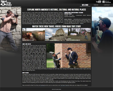
Road Trip Story is a series of travel videos featuring Historic, Cultural, and Natural places in the United States. The video series is co-produced by myself and Joseph Caylor. My responsibilities include the filming and editing, branding and web design.
While in the planning stage of the design of roadtripstory.com, we recognized that according to YouTube Analytics, 37.5% of the views of our videos are done via non-traditional access devices such as Mobile Phones (17.6%), Tablets (12.2%), and other devices. Only 62.5% of the views of our videos are done via a Computer. This made Mobile Accessibility one of the major development goals for roadtripstory.com.
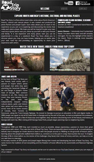
Utilizing the concepts of Adaptive and Responsive design philosophies, I developed RoadTripStory.com to adapt to the screen size of any access device. This includes the wide range of Android devices, with a plethora of different screen sizes and aspect ratios. This was accomplished completely by CSS. The layout of the page is designed to adapt to the type of the device, and then the content is designed to stretch to fill the available screen width. Pinch-zoom is disabled, and unneccessary for roadtripstory.com.

Roadtripstory.com is Apple Web App Capable. This allows users to tap "Add to Home Screen" on their iOS device, creating an icon on their Home Screen that they may tap, as they would open any other app, to interact with Road Trip Story outside of their browser, with no browser tabs or address bar to get in the way.
For laptop and desktop users, roadtripstory.com will adapt to the size of the browser window, and therefore, will not have a horizontal scrollbar when the browser window is reduced in size. This allows the user to make room on the screen for other applications, allowing side-by-side multi-tasking without the annoyance of having to constantly scroll back and forth horizontally across the webpage while reading if the text is wider than the browser window. Many websites have this problem. The minimum size that roadtripstory.com can be reduced to without requring a horizontal scrollbar is 320 pixels, compared to many webpages that have been built for a minimum of 980 pixels. (HD monitors are usually 1920 pixels wide).
Roadtripstory.com does not present a separate "mobile version" of the site to the visitor, nor is it a "full version" of the site, which would undoubtedly take longer to load. A "mobile version" is not necessary. The site is naturally optimized for efficiency on mobile devices where possible. For example, the background image is designed not to be downloaded when it is of no benefit to the user, because the background is not shown on smaller screens. This common sense solution saves the user from downloading a needless 142KB. It makes a particular difference on a mobile device. A user may be in a low-speed coverage area, approaching their monthly data usage limit, or they may be roaming.
As designers, if we utilize creative web design principles, we can make our sites more accessible and provide a better user experience for our audience.